
Collage & Illustration
- Jasmin Woodward
- May 13, 2023
- 3 min read
Updated: May 14, 2023
This week was about collaging and illustration which I was excited to try out. Whilst wondering how I would use collaging in my design process and whether I would want to use it as inspiration during the design process or as a collection/brand communication method.
We were shown multiple collage artists/ Illustrators in class and John Booth is one that I particularly liked. The way he draws and uses colours in such an innocent and fun way really drew my attention. People question the skill of artists like this because of lack of technicality. Although personally for me the way it can evoke and understand a feeling is what’s special to me.
John Booth


Pablo Thecuadro
I then researched other collage artists and Illustrators and came across Pablo Thecuadro , a Spanish photographer and collage artist, who’s way of communicating intrigued me. The way he plays with light and contrast, especially negative space creating the shapes he wants.


After finding Pablo Thecuadro, who mainly did the body, I looked for others I like that are focused more on the face. Unfortunately, I can’t find the artists, they are anonymous for the moemnt. Although I wanted to put them on here to talk about them.

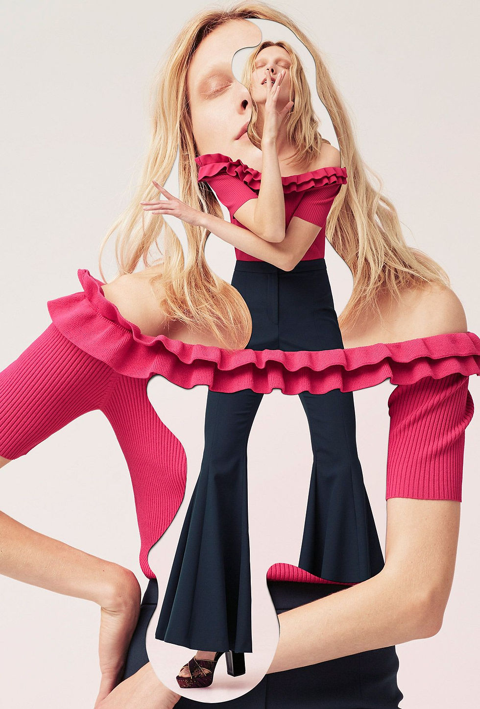
This one reminds of the webiste colours on Miu Miu and I really like the lighting and how it goes with the ripping on thr paper. The multiple rips and 3D tears on her shoulder make it look like her strap was ripped. The multiple diiferent faces in one makes us feel as if she has multiple people in her mind. Altogether it feels as though the character they have tried to create is mentally disturbed.

The red and the warm contours of her face create an overall cosy effect. The way they have cut up and redistributed the parts creates a shattered effect and draws you in to figure it out.

I love the blue background and light blonde hair colour mixture; I think it makes the image bright. The over exaggerated topsy turvy eyes and eyelashes dramatize the face so that is has extreme character. I also like oversized pouty lips; it makes it playful.
Experimenting

For the first one I just wanted to test bringing different things together that wouldn’t look like a flat photograph. So, I used one photo in colour and the other black and white, due to the light when I took the photo of this, it’s made the paper feel neutral and slightly beige. Due to this I think it brings the opposite together in a nice light. Leaving it like this so that the eyes can focus on the silhouette with the negative surrounding space.

For this one I took a model from my casting research and cut the phone out of her hand, replacing it with flowers from Vogue. A message which I think reflects my brand. To experiment with media, I used watercolour to exaggerate the flower out on to the page. Whilst adding an orange, white and blue star to oppose the pink.

For the drawing we were told to choose a face that we would want as a model and can use to put on our design drawings and line up. So, I chose this Woman with soft facial features and a wild natural aesthetic.

For shoes I really love pointed toes and I think that will be a signature style for my brand. The iridescent silver on the shoes and the misty green opposes each other and come together beautifully. I added pen on the outline of the shoes and points as well as the centre of the orchid to bring somewhere to focus the eye.

For this face I used magazine pages and cut them out to create an ethereal world bubbles as clouds and added the stars to cloud drawings I did with pencil, creating the idea of a flower.

For this Collage I’ve created a shoe plant with pointed toes and a flower extension up her leg to add volume.

For this one I’ve cut up a photo of incense from her shoes, moving through and up her body, whilst being supported by flowers.

This one was a nice contrast to the others and I wanted to keep the dark earth tones, so I cut out some stars and upgrades her shoes to fit her personality.
I really enjoyed creating a feeling with elements of photos I found online and from magazines. As well as adding pencil lines and watercolours to create dimension. I don’t massively love the non-professional aesthetic of collaging. Although playing with minimalism and negative space to create a more focused cleaner look I loved. Also playing with colours and light I find Therapeutic and will be using this technique in the future for boosts of inspiration.


Comments